Oregon Ducks Stomp Out Cancer Chemistry Hoodie
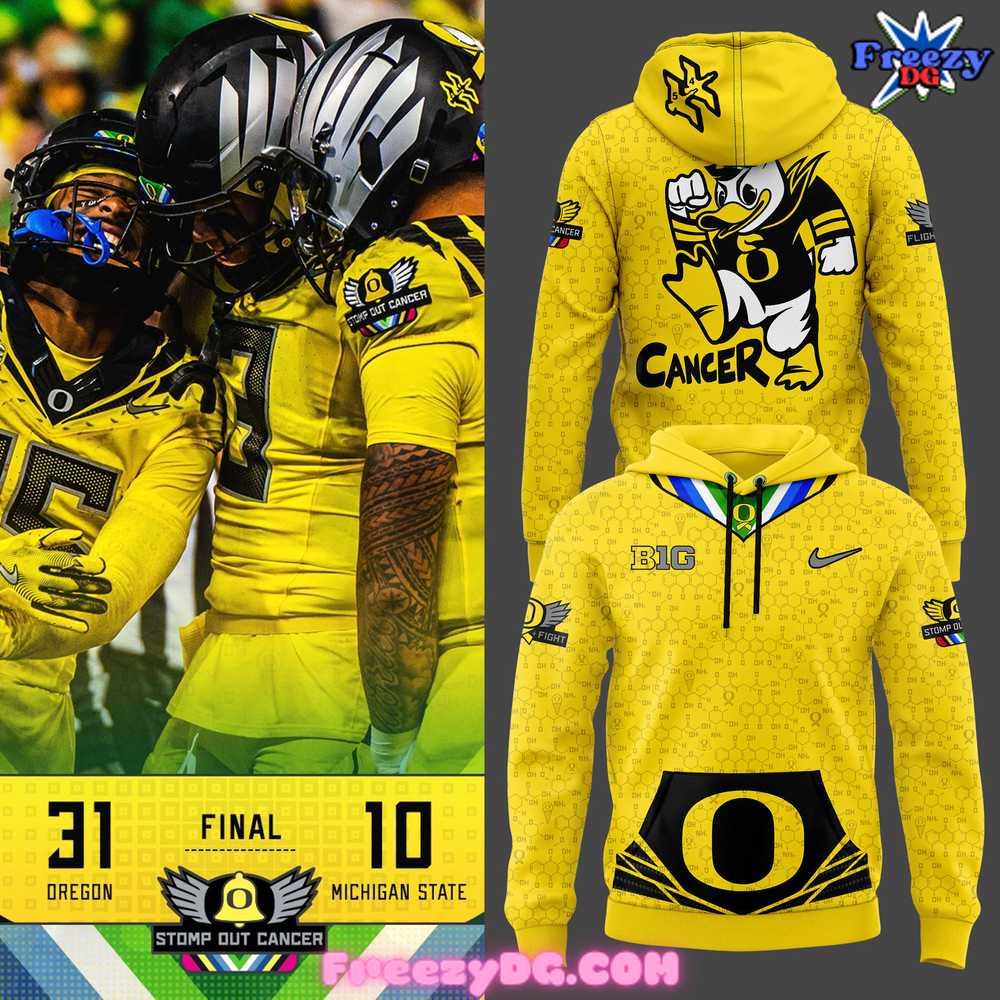
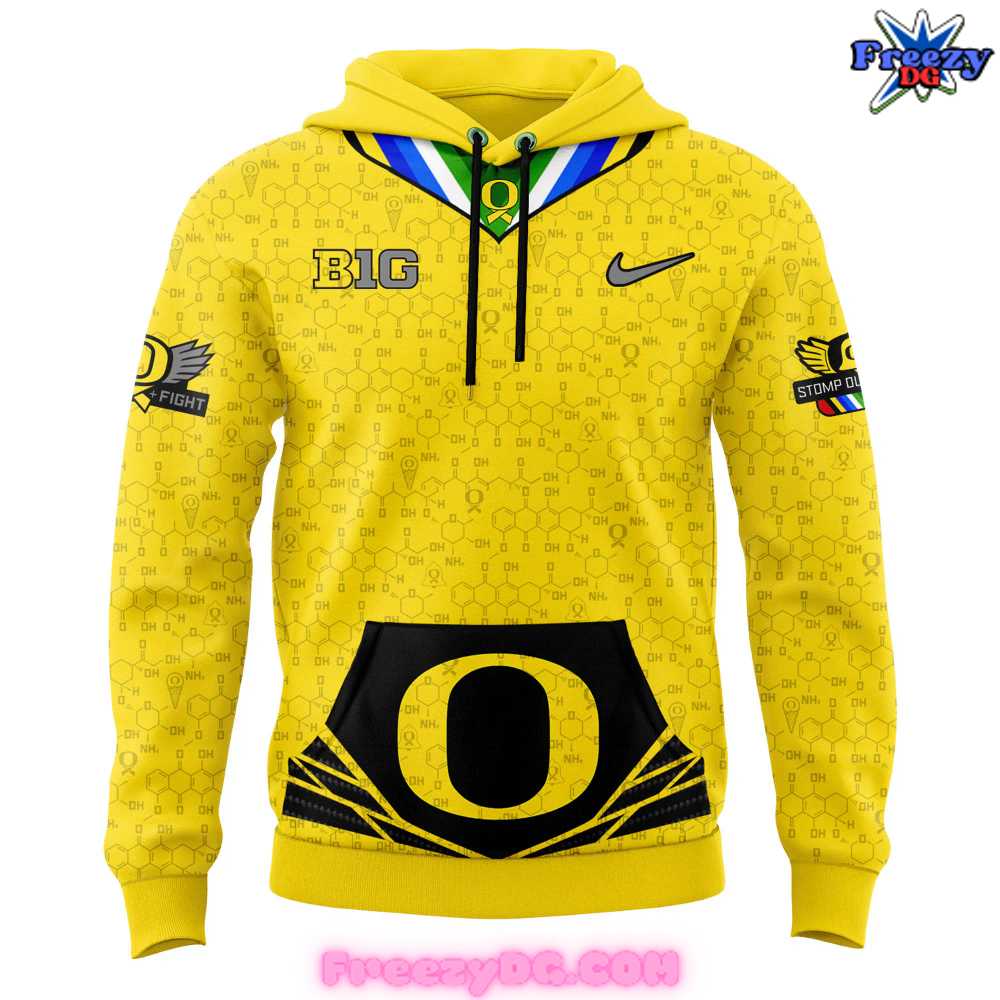
The Oregon Ducks Stomp Out Cancer Chemistry Hoodie is a vibrant and powerful piece of apparel that combines bold team spirit with a meaningful message. The bright yellow color serves as an eye-catching backdrop, symbolizing energy, hope, and positivity—qualities that resonate deeply with both fans and the fight against cancer. On the front, the iconic Oregon “O” logo is prominently displayed, framed by sleek black lines that create a dynamic contrast, giving the hoodie a modern and athletic vibe. The lower portion of the hoodie features a striking black panel that grounds the design, adding depth to the overall look.
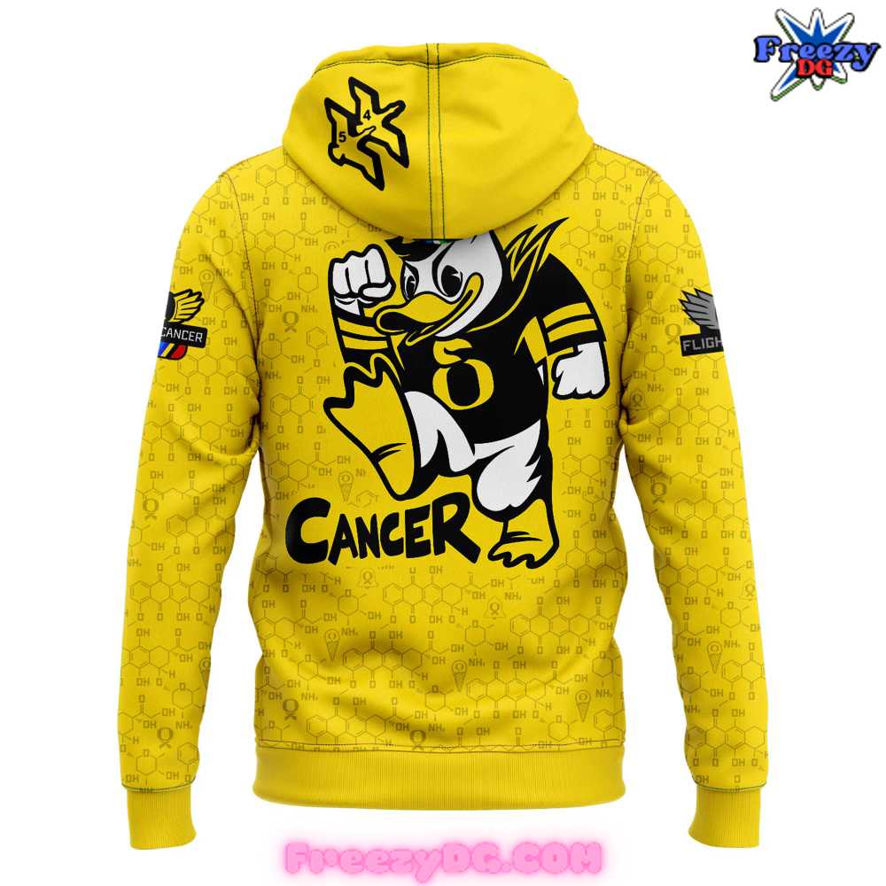
The back of the hoodie takes on a more personal and impactful tone, featuring a graphic of the Oregon Ducks mascot in a triumphant pose, stomping on the word “Cancer.” This imagery captures the resilience and determination in the fight against this disease, turning this hoodie into more than just fan apparel—it’s a statement of solidarity and support. The mascot’s bold stance, along with the vibrant design, creates an emotional connection, making it a powerful reminder of the importance of cancer awareness.
Additionally, the Nike swoosh and the Big Ten Conference logos are strategically placed to highlight the hoodie’s athletic roots and high-performance fabric technology. Designed for comfort and warmth, this hoodie is not only visually impactful but also practical for various weather conditions. The Oregon Ducks Stomp Out Cancer Chemistry Hoodie is more than just fan gear—it’s a meaningful tribute to the cause and a bold declaration of team loyalty.
Style & Design of Oregon Ducks Stomp Out Cancer Chemistry Hoodie
The Oregon Ducks Stomp Out Cancer Chemistry Hoodie is a striking blend of bold style and impactful messaging, designed to make a powerful statement both in terms of fashion and cause. The bright yellow color immediately sets the tone for an energetic and uplifting piece of clothing, making it perfect for fans who want to stand out while supporting a cause that matters. The hoodie’s structured fit is both comfortable and functional, featuring athletic design elements that seamlessly tie into the Oregon Ducks’ sporty aesthetic. The front is anchored by the large Oregon “O” logo, framed by sharp black accents that create a sleek contrast against the vibrant yellow, making it ideal for both casual wear and game day.
The back of the hoodie carries an even deeper message with a bold graphic of the Ducks’ mascot triumphantly stomping on the word “Cancer.” This design element not only adds a playful touch but also conveys a powerful visual narrative about strength, determination, and solidarity in the fight against cancer. The imagery of the mascot in action makes the hoodie more than just a stylish piece—it becomes a representation of hope and support. The addition of the number 6 on the duck’s chest gives the design a more personalized touch, adding layers of meaning for those who wear it.
From a stylistic perspective, the hoodie balances athletic functionality with symbolic power, making it both practical and meaningful. The inclusion of the Nike swoosh and Big Ten Conference logos add to the high-performance look, ensuring the hoodie remains connected to sports culture while promoting awareness. This hoodie isn’t just a piece of team merchandise—it’s a visually compelling, socially aware garment that allows fans to express their team loyalty while supporting a cause. The Oregon Ducks Stomp Out Cancer Chemistry Hoodie stands as a testament to how fashion and activism can come together to create something both stylish and significant.
Review Picture of Oregon Ducks Stomp Out Cancer Chemistry Hoodie


